Blending different styles without clashing requires a thoughtful approach to balance and cohesion. The key is to identify common elements such as colour, texture, or theme that link the styles together, creating a harmonious transition rather than a stark contrast. This prevents the space from feeling disjointed or chaotic.
Understanding the basics of each style helps to make intentional choices instead of random mixing. By focusing on complementary features, it becomes easier to merge diverse aesthetics while maintaining a unified look.
People often struggle because they try to combine too many strong features at once. Limiting bold elements and allowing subtle touches to carry the blend keeps the overall design coherent and visually pleasing.
Principles of Blending Styles
Blending different interior styles requires attention to core design elements like balance, colour, and theme. Successful combinations rely on setting clear priorities while maintaining a sense of cohesion.
Choosing a Dominant Style
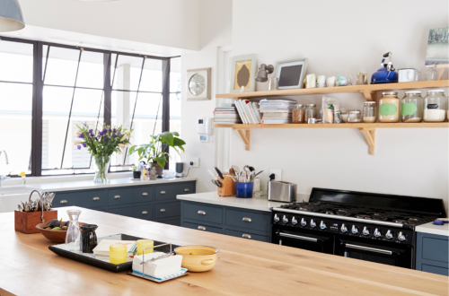
Selecting a dominant style sets the foundation for the space. For example, if mid-century modern forms the base, characterised by clean lines and warm woods, complementary styles like Scandi or industrial should support rather than overpower it.
The dominant style dictates the room’s colour scheme and materials. Industrial elements such as metal fixtures or exposed brickwork can enhance the mid-century look by adding texture without clashing with its warm aesthetic.
To avoid confusion, keep the dominant style consistent across key pieces, such as seating or flooring. Accent with secondary styles through accessories or lighting, ensuring the primary style remains visually central.
Understanding Visual Harmony
Visual harmony is achieved by balancing shapes, colours, and textures. It ensures that the blend appears intentional, not chaotic. For instance, both Scandi and mid-century modern favour simplicity but differ in material warmth and colour tones.
A practical way to maintain harmony is to use a limited colour palette across styles. Neutral shades like soft greys or whites can unify industrial’s rawness with Scandi’s light, natural finishes.
Textures also play a role. Combining the sleekness of industrial metal with the softness of Scandi textiles creates contrast without clashing. Repetition of shapes or materials across elements makes the space feel coherent.
Aligning Chronological and Thematic Elements
Styles often originate from different eras or design philosophies. Recognising these differences helps in blending them seamlessly. For example, mid-century modern emerged in the mid-20th century, while industrial style draws from early 20th-century factory aesthetics.
Aligning these involves respecting their historical context. Pair mid-century modern furniture with industrial lighting that reflects a similar vintage age, creating a dialogue between time periods.
Themes should complement one another. Scandi’s minimalism aligns well with mid-century modern’s functionalism, but industrial’s edgier vibe may require careful placement to prevent thematic conflict.
| Style | Era | Key Characteristics | Suitable Pairings |
| Mid-century modern | 1940s-1960s | Warm woods, clean lines | Scandi, subdued industrial |
| Scandi | Contemporary | Light colours, natural textures | Mid-century modern |
| Industrial | Early 1900s | Raw materials, metal accents | Mid-century modern (textured details) |
Establishing a Cohesive Colour Palette
A well-chosen colour palette bridges diverse styles by creating unity in any space. It ensures that elements from different design approaches feel connected yet distinct.
Selecting Base and Accent Colours
The base colour forms the foundation of the palette, typically a neutral or muted tone that supports other elements without overwhelming them. It often covers large areas such as walls, floors, or major furniture pieces.
Accent colours add character and interest. They are usually bolder or more saturated and used sparingly in accessories, artworks, or smaller furniture. Choosing accents that complement the base colour strengthens harmony.
A practical method involves selecting one base colour and two to three accent colours. Using a colour wheel can help identify complementary or analogous colours, ensuring balance. Consistency across styles depends on repeating these accents strategically throughout the space.
Balancing Neutral and Bold Shades
Neutral colours like grey, beige, or off-white create a versatile backdrop for blending styles. They soften transitions between contrasting elements and prevent clashing while maintaining openness.
Bold shades introduce personality but must be controlled so they don’t dominate. Integrating bold colours through accents rather than primary surfaces limits visual conflict.
In mixed-style interiors, the rule of thumb is 60% neutrals, 30% mid-tones, and 10% bold shades. This proportion facilitates flow and contrast without overloading the senses.
Incorporating Patterns with Care
Patterns carry strong visual weight and can disrupt a colour palette if overused. To avoid this, patterns should share colours found elsewhere in the palette. This reinforces colour ties even in varied styles.
Mix patterns by scale and complexity: large, simple patterns balance small, intricate ones. It prevents overcrowding and helps maintain a cohesive look.
Patterns appear best in textiles, such as cushions or rugs, letting them accentuate without overpowering. Restraint and repetition of key colours in patterns secure unity across different styles.
Unifying Through Materials and Textures
Blending styles requires a thoughtful approach to materials and textures, which act as the foundation for cohesion. Choosing complementary surfaces and tactile contrasts can help bridge different design elements effectively.
Mixing Natural and Industrial Materials
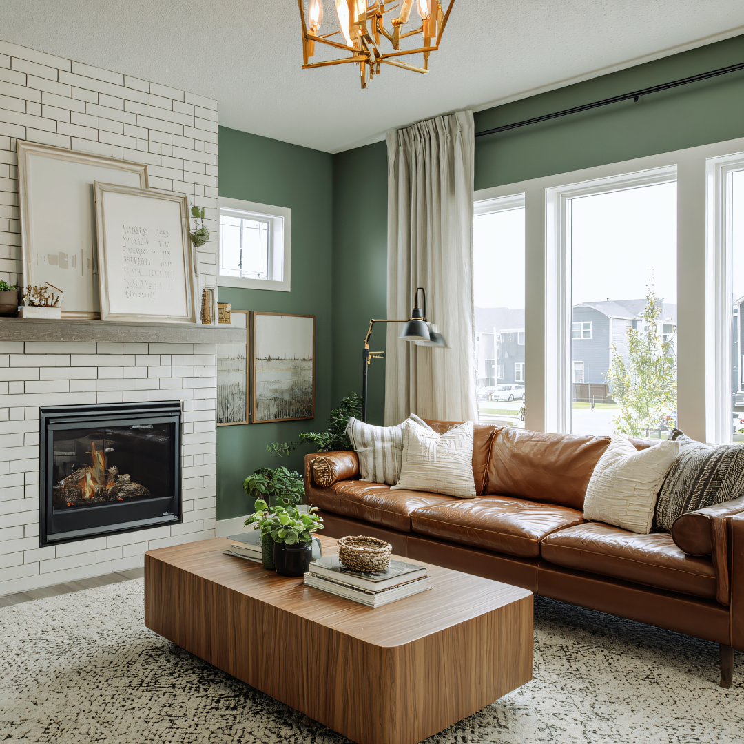
Introducing natural materials like wood or leather softens the harder edges of industrial design. A leather chair with a distressed finish pairs well with raw metal frames or exposed pipes.
Rustic wood tones complement industrial steel by adding warmth and character. Consider combining rough timber tables with sleek, utilitarian lighting for balanced layering. This juxtaposition creates harmony by contrasting temperature, texture, and colour without overwhelming the space.
Layering Textures Across Styles
Layering is key to depth and visual interest. Mixing smooth, rough, soft, and hard textures forms a tactile narrative that supports diverse styles without clashing.
For example, pairing a coarse jute rug with a smooth leather chair creates contrast while maintaining unity. Soft linens or wool throws layered over structured industrial furniture add comfort and dimension. The combination of varying textures encourages a natural flow between rustic warmth and industrial rigidity.
Accentuating with Statement Pieces
Statement pieces can anchor a blended style by acting as focal points. A bold leather chair with clean lines commands attention and knits other elements together.
Choose pieces with distinctive textures or finishes that complement both rustic and industrial features. For instance, a weathered metal chandelier above a handcrafted wooden dining table ties the room’s material story together. These pieces provide a visual pause and create cohesion through intentional material contrast.
Styling Strategies for a Harmonious Space
Successful blending of styles depends on careful planning and attention to detail. Thoughtful consideration of proportions, distinct zones, accessorising, and mixing eras can create cohesion without conflict.
Balancing Proportions and Scale
Proportion and scale are vital for preventing visual chaos. Mixing a large mid-century modern sofa with small boho side tables risks imbalance unless the elements are chosen deliberately. Larger pieces from contemporary furniture often demand complementary medium or small items in minimalist styles like Scandi to avoid overwhelming the room.
Furniture heights should relate logically; pairing a low-profile Scandi lounge chair with a tall, heavy mid-century lamp might feel mismatched. A practical approach is to measure key pieces and maintain a consistent scale ratio. This method ensures no single item dominates or looks out of place.
Creating Distinct Style Zones
Dividing a room into style zones allows different aesthetics to coexist naturally. For instance, a living space can include a boho reading nook with textured poufs and plants, while the main seating area focuses on sleek contemporary furniture. Physical markers such as rugs or shelving can visually separate these zones.
A clear definition avoids style confusion and helps highlight the best features of each style. Zones also allow gradual transitions; a Scandi dining area might bridge a mid-century lounge by following a neutral palette, connecting disparate designs smoothly.
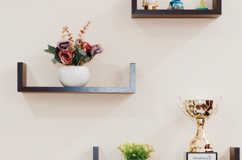
Curating with Accessories and Décor
Accessories play a key role in tying styles together. Using cushions with consistent colour themes across boho and contemporary seating brings unity. Select artwork that complements the entire room palette to avoid clashing visuals.
Metal finishes and lighting also impact balance. Mixing matte black mid-century lamps with brass boho candleholders works if they share a similar design language, such as clean lines or geometric shapes. Accessories should support the overall mood rather than compete for attention.
Experimenting with Contemporary and Vintage Pieces
Combining new and vintage pieces enriches character but demands a careful eye. A contemporary glass coffee table paired with a vintage mid-century sideboard can work when both share simplicity in form. Avoid fussy or ornate vintage items alongside minimalist contemporary styles, as these contrast too sharply.
Mixing eras highlights style history and adds depth. Consider integrating Scandi’s clean lines with bold boho textiles over classic mid-century wooden furniture. The key is controlled contrast—balancing warmth and modernity without overcrowding the space.